The key to establishing and keeping a thriving online presence is mastering the ability to identify poor website design. Here’s a quick rundown of website no-nos, along with some advice on how to prevent them.
1. Broken landing pages
The majority of websites that have been up for more than a few years have this problem. It’s not ideal for a customer and possibly a consumer to arrive on a page that doesn’t work properly owing to technical issues or has information that hasn’t been updated in some time. Make it a habit to check in on the status of your website’s web pages as well as the integrity of your content management system on a consistent basis.
2. Awful Site Search
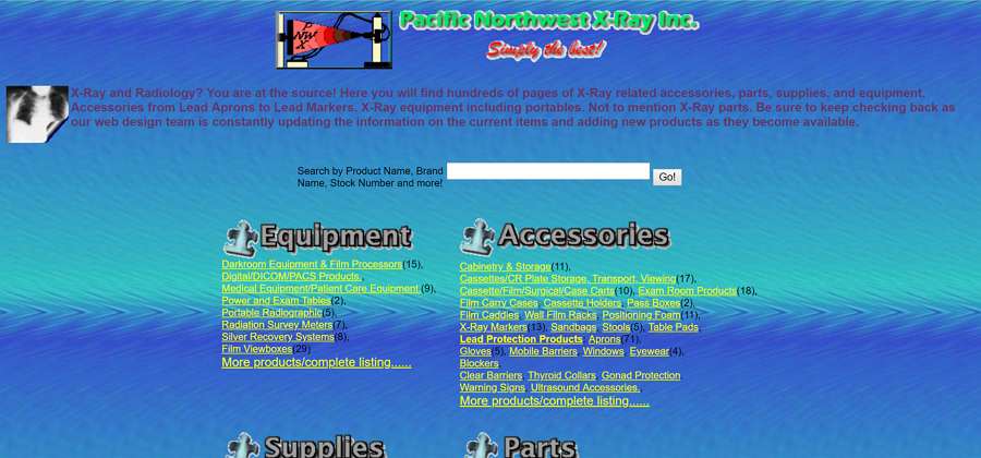
Site search goes beyond a simple search bar, particularly for online stores and inventories of goods and services. Improving the user experience, decreasing the bounce rate, and raising the conversion rate are all results of a well-implemented site search. Either the search features already included in your content management system or a separate, commercially available search tool might be useful.
3. Slow Loading Speed
This is a highly technical problem that depends on a wide variety of factors, such as the hosting provider, subscription plan, the integrity of the website code (Content Management System), and the consideration of mobile device displays in the layout of the website’s user interface. Check-in with your front-end developer about any concerns with loading time or display, and use a third-party application to keep tabs on how well the site is holding up.
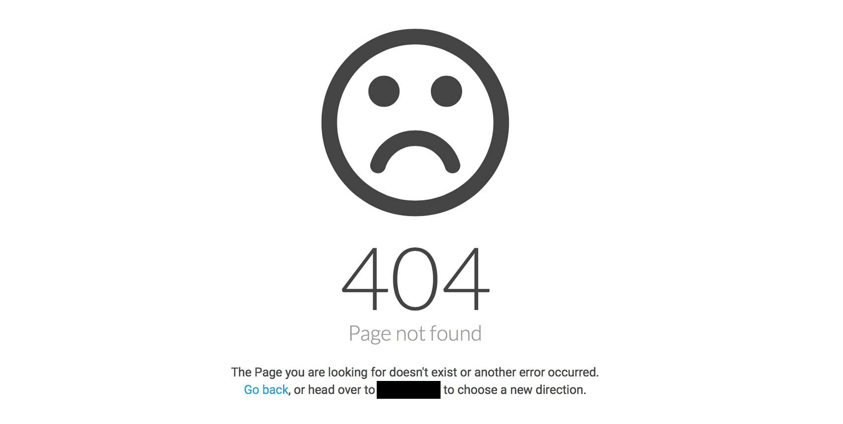
4. 404 Page Not Found
When a visitor to a website clicks on a faulty link, the site usually displays a “404 Not Found” error message. Assist the user in locating the desired data by recommending relevant articles and providing a list of the site’s most vital pages. One more technique to dazzle the reader and compensate for not providing the needed content is to have a sophisticated layout and a witty message.
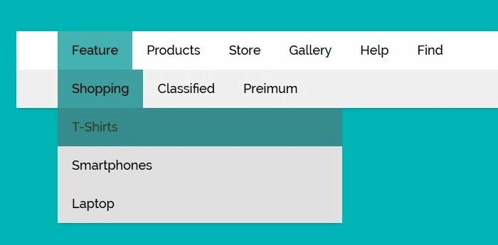
5. Crowded navigation menu
There’s a risk that a cluttered menu can turn visitors away from your site rather than aid them in finding what they’re looking for. Think carefully about the structure of your primary navigation and make use of the footer by providing the information your customers are most likely to be seeking there.


